The time off request form in Odoo has always been functional, but “functional” is a generous way of saying it made you think about fields that should have been invisible. Picking a day period meant choosing from a dropdown that existed separately from the date fields. Requesting a half-day meant mentally mapping “Morning” to one dropdown value while checking that the hours made sense in another. Odoo 20 tears the whole thing down and rebuilds it around the way people actually think about taking time off — starting with duration, not database fields.
Duration Badges Replace the Dropdown Guessing Game
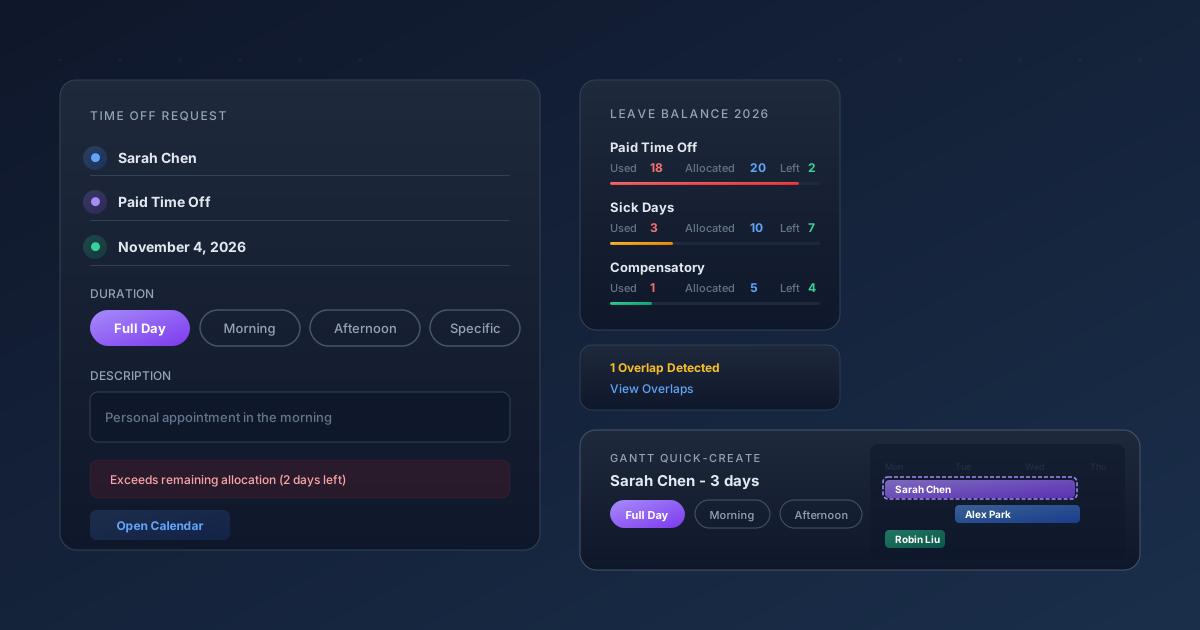
The most visible change is a row of badge selectors that replace the old Day Period and Hours fields entirely. When you open a new time off request, you now see four tappable badges: Full Day, Morning, Afternoon, and Specific. For standard leave types, the first three are self-explanatory — click one and the dates adjust accordingly. The fourth, Specific, appears only for hour-based leave types and opens a start/end date-time picker with an editable hours total. It’s the kind of interaction that feels obvious in hindsight but required rethinking how the form stores and displays duration data.
Single-day requests now show a single date field instead of two identical dates. That sounds trivial, but it removes an entire class of user error where someone would accidentally set different start and end dates for what they intended as a one-day absence. The form adapts its layout based on what you’re actually requesting rather than showing every possible field and hoping you ignore the irrelevant ones.
A Sidebar That Answers the Question Before You Ask It
The right side of the request form now carries a persistent summary panel showing your leave balance for the current year. For each time off type — paid leave, sick days, compensatory time — you see three numbers: days used, days allocated, and days remaining. This is the information that every employee checks before submitting a request, and until now it lived on an entirely different screen.
Below the balance summary sits an overlaps detection box. If your requested dates collide with a colleague’s approved time off, the panel flags it immediately with a “View Overlaps” link that opens the relevant records. For managers who need to keep minimum staffing levels, this eliminates the back-and-forth that used to happen after a request was already submitted. And if a request would exceed the remaining allocation, a red warning banner appears directly on the form — not as a validation error after you click Save, but as a real-time signal while you’re still editing.
The Gantt View Becomes a Request Interface
The bigger shift might be what happened to the Gantt chart. Selecting a range of cells in the Time Off → Overview Gantt view now opens a streamlined quick-create popup instead of a full form. The popup shows the Time Off Type selector, the same duration badges from the main form (or an hours “per day” field for multi-day selections), and a Description field. The popup title displays the employee name and duration at a glance, like “Sarah Chen — 3 days.”
This turns the Gantt chart from a read-only planning tool into an active request interface. A manager scanning the team’s schedule can create or approve time off without navigating away from the visual timeline. It saves roughly four clicks and two page loads per request, which adds up fast during peak vacation planning seasons when HR teams process dozens of requests daily.
Leaner Lists, Smarter Navigation
The cleanup extends beyond the form itself. The Department side panel that used to appear on the time off list view is gone, along with the Department column from the list. These were holdovers from an era when time off was managed centrally by HR rather than by direct managers. Removing them declutters the interface for the people who actually use it most frequently — employees checking their own requests and team leads reviewing their direct reports.
A new Calendar smart button on the request form opens the employee’s personal time off calendar in one click, providing a visual sanity check for whether the requested dates actually make sense in context. It’s a small addition, but it connects two views that previously required navigating through separate menu paths.
Why Form Design Is a Feature
These aren’t cosmetic tweaks. The old time off form forced users to translate their intent (“I need Thursday afternoon off”) into a sequence of field selections that didn’t map to that thought process. The new form starts from the duration and works backward to the data. That inversion matters because time off requests are one of the highest-frequency interactions in any HR system — every employee uses them, most of them several times a year, and friction in the process generates support tickets that land on HR’s desk.
Odoo 20’s redesign treats the request form as a product surface rather than a data entry screen. The sidebar balance, the allocation warnings, the overlap detection, the Gantt quick-create — each one eliminates a round trip that used to require opening a different view or asking a colleague. For a feature that sounds as mundane as “requesting time off,” the cumulative effect is anything but.