When Odoo launched its Marketing Card module earlier this year, it solved a real problem: giving marketing teams a way to create branded digital cards for events, promotions, and outreach without touching external design tools. But the module had a blind spot. Every card rendered in the database’s default language. If your company ran campaigns across France, Germany, and Brazil, you were generating three separate card designs manually — same layout, same branding, different text. It was busywork that defeated the purpose of having a template system.
That gap closes with the latest update. Marketing Cards now support full multi-language rendering, and the send workflow has been rebuilt from the ground up.
Translating Card Text Without Rebuilding the Card
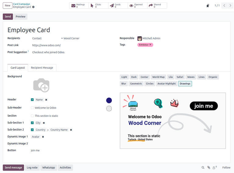
The core change is deceptively simple. Every static text field on a Marketing Card — the Header, Sub-Header, Section title, and both Sub-Section fields — now supports inline translation. When a database has more than one language installed, a small “EN” button appears next to each text field. Clicking it opens a translation popup where marketers can enter the equivalent text in every active language.
This is the same translation mechanism Odoo uses elsewhere in the platform, but its arrival in Marketing Cards changes the workflow fundamentally. Instead of duplicating an entire card campaign for each language, teams build one card with one design and translate the text layer. The layout, branding, colors, and imagery stay identical. Only the words change.
The translation button only appears when the database has multiple languages configured. Single-language installations see no difference in the interface — no clutter, no unnecessary buttons. It is a conditional UI element that shows up exactly when it becomes relevant.
Language Selection at Send Time
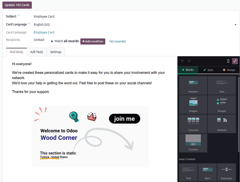
The second half of the update tackles what happens when you actually send the cards. Previously, clicking “Send Cards” opened a popup window where marketers configured recipients and message details. That popup is gone. In its place is a dedicated full page with more room to configure the mailing.
The most significant addition to this page is the Card Language field. When preparing a mailing, marketers now explicitly select which language the card should render in. The available options depend on which languages are installed on the database, so a company running English, French, and Spanish sees those three choices. The selected language determines which translation of the Header, Sub-Header, and Section fields appears on the generated card.
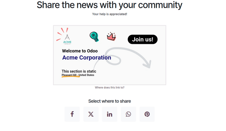
This means a single campaign can dispatch multiple mailings in different languages, all using the same underlying card design. Send one batch in French to your Paris contacts, another in English to your London list, and a third in Spanish to your Madrid segment. The card looks identical in every language. The text is localized. The brand stays consistent.
Default Target URLs That Actually Make Sense
The update also fixes a subtle usability problem with the Post Link field. This field controls where recipients land when they interact with the card. Previously, leaving it blank produced a dead end — the card had no destination. The new behavior is smarter.
When the Post Link is omitted, Odoo now automatically directs recipients to the record’s associated webpage. For event-linked cards, that means the event page. For contact-linked campaigns, the relevant portal page. If no published webpage exists for the record, the system falls back to the event homepage or the company’s main site.
It is a small default that eliminates a common mistake. Marketing teams creating event promotion cards no longer need to remember to paste the event URL into the Post Link field. The system infers the most logical destination and uses it automatically. Teams that want a custom destination can still override it — the field remains fully editable.
Why the Interface Change Matters
Moving the send workflow from a popup to a dedicated page is not just a cosmetic change. Popups have inherent constraints: limited screen real estate, awkward scrolling behavior on smaller monitors, and no way to bookmark or share the configuration. A full page gives marketers room to see the recipient list, email form, message body, and language selection without scrolling through a cramped modal.
It also makes the send step feel less like an afterthought bolted onto the card design screen and more like a deliberate stage in the campaign workflow. Design the card. Translate the text. Configure the mailing on a proper page. Send. Each step has its own space.
For teams running Marketing Card campaigns across multiple regions, the multi-language support alone removes a significant amount of redundant work. Combined with the smarter default URLs and a more spacious send interface, this update turns what was already a useful tool into one that scales across languages without multiplying the effort.