
There’s a certain kind of feature burial that happens in large software systems. A genuinely useful tool gets built inside one module, works well for that module’s users, and then sits there for years while users of other modules never discover it because they have no reason to look inside a section that isn’t theirs. Odoo’s product catalog was one of those features.
Built originally as part of the Inventory module, the product catalog is a visual, card-based interface for browsing and selecting products. It shows product images, names, prices, and packaging options in a grid layout that’s significantly faster to navigate than scrolling through a dropdown list or switching between form views. The problem was its address: it lived under Inventory → Warehouses & Storage → Inventory Management, a path that a sales rep or purchasing agent would never think to visit.
Odoo has now moved it to the Essentials section — the part of the documentation (and the product) that covers features shared across all apps. It’s a reclassification that matches what the feature actually does: the product catalog isn’t an inventory tool, it’s a product selection tool that serves Sales, Purchasing, Manufacturing, and Repairs equally.
How the Product Catalog Works
The catalog can be accessed in two ways. The direct route is a dedicated menu entry that opens the full catalog view. The more common path is through a database record — when creating a sales order, a purchase order, a manufacturing order, or a repair order, there’s an option to open the catalog and browse products visually rather than typing into a product search field.
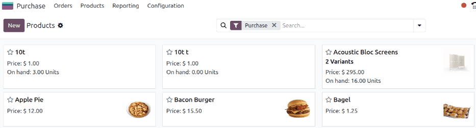
Each product appears as a card showing its image, name, and pricing information. The card layout makes it practical for businesses where products are visually distinct — hardware components, furniture, food items, fashion — because the person placing the order can identify the right product by sight rather than by code or description.
Filtering options sit at the top of the catalog, allowing users to narrow down the display by category, type, or search term. For a catalog of a thousand products, this turns what would be a painful scrolling exercise into a few clicks and a search query.
Per-Unit Pricing and Packaging Controls
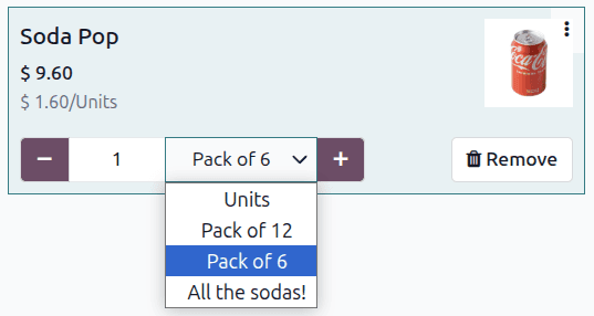
The feature that makes the catalog more than just a pretty product grid is the per-unit pricing display for packaged items. When a product has multiple packaging options — individual units, boxes of twelve, pallets of forty-eight — the catalog card shows the per-unit cost for each packaging tier. A purchasing agent can see at a glance that buying by the pallet drops the per-unit cost by 15%, without needing to calculate the unit economics manually.
The packaging dropdown appears directly on the product card, and selecting a packaging option adjusts the quantity and total price accordingly. This inline control means the purchasing decision and the order entry happen in the same view — no switching between a price list reference and an order form.
Adding and Removing Products
Quantity controls are built into each card. Users can add products with a single click, adjust quantities using increment and decrement buttons, or type a specific quantity directly. Removing a product is equally straightforward. The running total updates in real time as products are added or removed, so the person building the order always knows where they stand.
This interaction model is borrowed from ecommerce — it feels more like adding items to a shopping cart than filling in an ERP form. For businesses where the people placing orders aren’t power users of the ERP system (think store managers ordering restocks, or maintenance teams requesting replacement parts), this lower friction translates directly into faster order creation and fewer data entry errors.
Why the Reclassification Matters
Moving the product catalog from Inventory to Essentials is more than a documentation reshuffling. It reflects a design decision about where shared functionality belongs. When a feature is relevant to four different apps, burying it inside one of them creates an artificial discovery barrier. Sales teams don’t browse Inventory documentation. Manufacturing planners don’t look through Purchasing help pages. By placing the catalog in Essentials, every user who deals with products encounters it in the natural place they look for cross-functional tools.
The practical consequence is adoption. Features that people don’t know about don’t get used. A visual product catalog that streamlines order entry doesn’t help anyone if the only people who know it exists are warehouse managers. Now that it’s positioned as a shared capability, sales teams building quotations and purchasing agents creating POs are far more likely to discover it — and once they try the card-based browsing interface, going back to dropdown product selection feels like a downgrade.