Odoo Studio has always occupied an awkward middle ground. It promised business users the ability to reshape their ERP without writing code, but in practice, the gap between what Studio could do and what a developer could achieve with XML view definitions was wide enough to drive entire consulting projects through. Version 20 takes a serious run at closing that gap, overhauling both the form view and list view editors with capabilities that were previously locked behind the developer toolchain.
The changes are practical rather than flashy. Drag-and-drop finally works the way you’d expect it to, list columns gain controls that previously required manual XML edits, and the widget system — one of Odoo’s most powerful customization layers — becomes directly accessible from within the visual editor.
Form View Fields Finally Land Where You Drop Them
The form view editor in earlier Studio versions handled field placement with a best-effort approach. You could drag a field from the sidebar onto the form, but where it actually landed was often a surprise — the system would snap it to the nearest available slot, which might be a different column or section entirely. For forms with complex layouts, this meant repeated attempts and occasional trips to the XML editor to fix positioning.
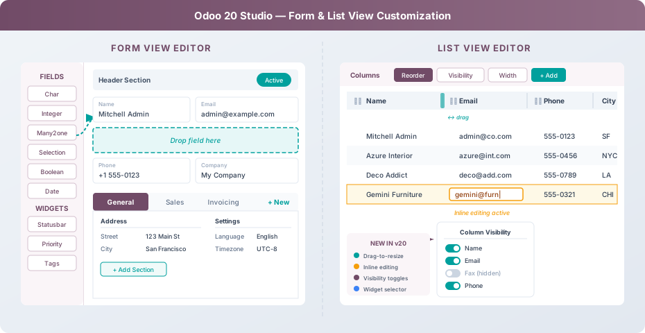
Version 20 replaces the old snapping logic with precise drop zones. When you drag a field over the form canvas, highlighted regions show exactly where the field will be inserted — between two existing fields, at the end of a column group, or inside a specific section. The visual feedback is immediate and accurate, eliminating the guess-and-check cycle that plagued earlier releases.
Fields can now be repositioned after initial placement with the same drag-and-drop mechanism. Previously, moving a field often required removing it and re-adding it, which reset any custom labels or widget configurations attached to it. The new editor preserves all field properties through repositioning.
Widgets Step Out of the Developer Console
Odoo’s widget system is what transforms a generic text field into a phone number with a click-to-call link, a color picker, a progress bar, or a tag selector. Until now, changing a field’s widget in Studio meant navigating to the field’s properties panel, scrolling to find the widget dropdown, and hoping you remembered the internal name of the widget you wanted. Many users didn’t even know widgets existed.
The updated sidebar now groups available widgets alongside field types in a dedicated panel. When you select a field on the form, compatible widgets appear with visual previews showing how each one renders actual data. Statusbar, Priority stars, Tags, Badge, Radio buttons, and a dozen others are now discoverable rather than hidden. Applying one is a single click, and switching between widgets on the same field preserves the underlying data.
This is a bigger deal than it sounds. Widgets are what make Odoo forms look and behave like purpose-built applications rather than generic database editors. Giving business users direct access to them removes one of the most common reasons for escalating customization requests to developers.
Tabs and Sections Become First-Class Citizens
Complex forms in Odoo use notebook tabs to organize related fields into logical groups — a contact record might have tabs for General information, Sales data, Invoicing details, and Internal notes. Within each tab, sections further subdivide the layout into labeled groups.
Studio’s handling of these structures was limited. Adding a new tab required a specific sequence of actions, and reordering tabs was not supported at all without XML editing. Section headers could be created but not moved, and the visual distinction between a section and a simple label was unclear.
The version 20 editor treats tabs and sections as draggable containers. A dedicated “+ New” button at the end of the tab bar creates additional tabs with a single click. Existing tabs can be reordered by dragging their headers. Sections within each tab get their own “Add Section” control, and section headers can be repositioned, renamed inline, or collapsed to reduce visual clutter while editing.
List View Columns Get Proper Controls
The list view editor received less attention than the form view in previous Studio releases, which was unfortunate given how much time most users spend staring at list views. Column ordering was drag-and-drop, but that was about it — column widths, visibility, and display behavior were not configurable without code.
Version 20 adds a toolbar above the list editor with three distinct controls: Reorder, Visibility, and Width. The Reorder mode lets users drag column headers to new positions with a clear insertion indicator between columns. The Visibility panel presents a toggle for every available field, including ones not currently displayed, so users can show or hide columns without adding them through the field sidebar first.
Column width management introduces drag-to-resize handles on column borders. Grab the border between two column headers and pull it left or right to adjust the proportional width. The system enforces minimum widths to prevent columns from collapsing to the point where data becomes unreadable, and the total layout redistributes proportionally when a column grows or shrinks.
Inline Editing Arrives in the List Editor
One of the more requested Studio capabilities was the ability to configure which list columns support inline editing — letting users modify cell values directly in the list without opening the full form view. Developers could set this with aneditable="bottom" attribute in XML, but Studio offered no equivalent.
The updated list editor includes an inline editing toggle at both the view level and the individual column level. View-level toggling enables or disables inline editing for the entire list. Column-level controls let administrators mark specific fields as read-only within an otherwise editable list — useful for protecting calculated fields, status indicators, or reference numbers while allowing direct edits to quantities, dates, or assignments.
When inline editing is active, the editor highlights the current row and shows the active cell with an input border, giving a clear visual distinction between browsing and editing modes. Tab navigation between editable cells follows a left-to-right, top-to-bottom flow that matches spreadsheet behavior.
Field Properties Get a Consolidated Panel
Selecting any field in either the form or list editor now opens a consolidated properties panel on the right side of the screen. This panel combines what was previously scattered across three or four different dialogs: the field label, technical name, data type, widget selection, visibility conditions, required/read-only flags, default values, and help text.
For relational fields (Many2one, One2many, Many2many), the panel adds domain filtering — previously a developer-only capability. Users can set simple conditions through a visual filter builder, like “only show products where Product Type is Storable” or “only show contacts where Country is United States.” Complex domain expressions still require the advanced mode, but the most common filtering scenarios are now fully accessible.
What This Means for the Studio Workflow
Taken individually, each of these changes is a convenience improvement. Taken together, they represent a meaningful shift in who can customize Odoo views and how quickly they can do it. The form view editor now handles the 90% case — adding fields, repositioning them, organizing into tabs and sections, selecting the right widget — without requiring any knowledge of XML view inheritance or field attributes.
The list view editor arguably makes the bigger leap. Column management was the area where Studio lagged most visibly behind manual development. Visibility toggles, resize handles, inline editing configuration, and proper reordering bring the visual editor to functional parity with what a developer would write in a tree view definition for the vast majority of use cases.
The remaining gap — and it still exists — is in advanced scenarios like conditional visibility expressions, computed fields, and custom button actions. Those still require either the Studio advanced mode or direct development work. But for the everyday task of shaping how a business sees and interacts with its data, version 20’s Studio is substantively closer to being the self-service tool it always promised to be.