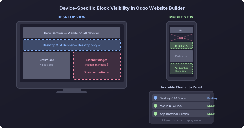
Responsive web design isn’t just about making things smaller on phones. Sometimes the right experience for a mobile visitor is fundamentally different from what works on a 27-inch monitor, and the best solution is to show entirely different content blocks depending on the device. Odoo’s Website Builder has supported this asymmetry for mobile for a while — you could mark any block as hidden on mobile devices. But the reverse wasn’t possible. You couldn’t hide a block specifically on desktop.
That limitation is gone. The Website Builder now supports desktop-specific block hiding, giving site builders full control over what appears on which device class. And the Invisible Elements panel — the sidebar that shows all currently hidden blocks — has been updated to filter by the current display mode, so you only see the blocks that are invisible for the viewport you’re actually editing.
Why Desktop Hiding Matters More Than It Sounds
The most common use case is mobile-specific content. Think about an app download banner that only makes sense on a phone, or a tap-to-call button that’s useless on a laptop. Before this change, the only way to implement these patterns in Odoo was through custom CSS — adding d-none d-lg-blockclasses manually, which required technical knowledge and broke the visual editing experience.
With the new toggle, a marketing team can create a mobile-optimized call-to-action block, mark it as hidden on desktop, and then create a separate desktop version with different content, layout, or imagery. Neither version clutters the other’s viewport. The editing is entirely visual — no CSS knowledge required, no code view, no Bootstrap class manipulation.
This pattern is especially valuable for e-commerce sites. A product category page might show a compact filter sidebar on desktop that wouldn’t work on mobile, while the mobile version uses a full-screen filter overlay instead. Rather than trying to make one block work for both contexts with responsive CSS, the site builder can create two purpose-built blocks and let the visibility system handle the switching.
The Invisible Elements Panel Gets Smarter
When you hide blocks on both mobile and desktop, the editing experience can get confusing fast. Which blocks are hidden right now? Which ones only appear on mobile? The Invisible Elements panel in the left sidebar previously showed all hidden blocks regardless of why they were hidden. If you had ten blocks hidden on mobile and three hidden on desktop, all thirteen would show up in a single list.
Now, the panel respects the current display mode. When you’re editing in desktop view, it shows only the blocks that are invisible on desktop. Switch to mobile preview, and the panel updates to show the mobile-hidden blocks. This sounds like a small detail, but it eliminates a genuine source of confusion when managing complex responsive layouts. You see what’s relevant to what you’re editing, nothing more.
Each hidden block in the panel can be clicked to jump to its position on the page, and the existing toggle to make it visible again works the same as before. The only difference is the filtering — the panel is now contextual rather than exhaustive.
What Stays the Same
The underlying mechanism is the same CSS display system that powered mobile hiding. Odoo uses Bootstrap’s responsive utility classes under the hood, so the behavior is reliable across browsers and doesn’t depend on JavaScript viewport detection. The blocks are fully rendered in the HTML regardless of visibility — they’re hidden via CSS, not conditionally rendered — so there’s no impact on SEO or page structure.
For site builders who have already set up mobile-hidden blocks, nothing changes. The existing “hide on mobile” toggle works exactly as before. The new “hide on desktop” option appears alongside it, and the two can be used independently. You can even hide a block on both mobile and desktop if you want it invisible everywhere but still preserved in the page structure — though at that point, you probably just want to delete it.
The Bigger Picture for Odoo Websites
This addition closes a gap that has existed since Odoo first introduced responsive editing. The mobile-first approach made sense when it was introduced — hiding elements on smaller screens is the more common need. But as businesses build increasingly sophisticated websites on the platform, with dedicated mobile experiences, app-specific landing pages, and device-targeted promotional content, the ability to work in both directions becomes essential.
It’s also a sign that Odoo is taking its website builder seriously as a competitor to dedicated site-building tools. WordPress, Webflow, and Squarespace have all offered device-specific visibility controls for years. For Odoo to position its Website Builder as a genuine alternative — especially for businesses already running their operations on Odoo — these kinds of design-level controls need to be table stakes, not missing features.
The implementation is clean, the editing experience is intuitive, and the updated Invisible Elements panel prevents the complexity from getting out of hand. For marketing teams that have been working around the limitation with custom CSS or duplicate page templates, this is a welcome simplification.