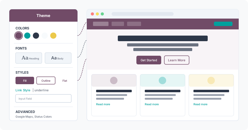
Website builders tend to give you two options: either everything is configurable but buried in a maze of nested menus, or the controls are simple but too blunt to produce anything distinctive. Odoo’s Website Builder has historically leaned toward the latter — a single “Theme” panel that handled colors, fonts, and styles in one undifferentiated stack. The redesign flips that approach, splitting the panel into purpose-built sections that let designers tune individual elements without ever opening a code editor.
The changes run deeper than a UI reorganization. The color system now surfaces its architectural logic directly in the panel. Font controls work at the element level rather than globally. And an entirely new Styles section breaks button, link, and input field customization into distinct controls — something that previously required CSS overrides or theme module modifications.
Five Named Colors, Three Main Plus Two Supporting
Odoo’s color system has always worked on a palette of five named colors, but the previous interface obscured the relationship between them. The redesigned panel makes the hierarchy explicit: three “Main” colors that carry your brand identity, plus two “Light & Dark” colors that provide contrast and depth.
From these five colors, the system automatically generates color presets — predefined combinations that determine how backgrounds, text, headings, links, and buttons interact across different page sections. Rather than picking individual colors for each element in each context, designers set the palette once and let the preset engine derive consistent combinations. Change a single main color, and every section using presets built from it updates in sync.
Status colors — Success, Warning, Info, and Error — now live in a clearly labeled Advanced section rather than mixed into the main palette. These handle feedback messages, form validation, and system notifications. Most designers will never touch them, and separating them from brand colors prevents accidental changes that could make error messages invisible or success indicators blend into the background.
Fonts Go Per-Element With Custom Upload Support
The font controls no longer apply a single typeface across the entire site. Instead, the panel breaks typography into four distinct elements: Paragraphs, Headings, Buttons, and Input Fields. Each gets its own font family selector and size controls.
This matters for design coherence. A site might use a geometric sans for body text but a serif for headings to create typographic contrast. Button text might need a different weight or slightly different sizing to read clearly at small dimensions. Input fields often benefit from a monospace or slightly larger typeface for readability during data entry. The previous all-or-nothing approach forced these distinctions into custom CSS; now they’re first-class panel controls.
Font sizing goes granular too. Each element section includes an expandable size panel with per-level controls. Headings get individual sizes for H1 through H6. Buttons differentiate between small, default, and large sizes. The controls use relative units, so responsive behavior works without additional breakpoint overrides.
Custom font upload rounds out the section. Click the font family dropdown, select “Add a Custom Font” at the bottom, and either pick from Google Fonts directly or upload a file from your machine. Once installed, the custom font appears alongside system defaults in every element’s font selector.
A Dedicated Styles Section for Buttons, Links, and Inputs
The biggest structural addition is a new Styles section that collects element-specific visual controls that were previously scattered or simply missing from the no-code interface. It covers three areas:
Buttons get primary and secondary style selectors with three options each: Fill (solid background), Outline (border only), and Flat (text-only with no background or border). The combination of primary/secondary designation and fill style produces six distinct button variations without writing a line of CSS. Border radius, padding, and shadow controls complete the button identity.
Linksreceive dedicated color and decoration controls. Rather than inheriting whatever the color preset assigns, designers can now override link appearance independently — choosing underline, color shift, or no decoration for default states, with separate hover behavior. This was a consistent pain point: link styling that looked fine in one color preset would disappear against certain backgrounds in another.
Input Fieldsget their own styling panel for the first time. Font family, size, border style, background color, and focus states are all configurable. For businesses that live on form submissions — lead capture, contact forms, checkout flows — being able to make input fields visually prominent without custom development is a significant workflow improvement.
Theme Selection Gets a Clearer Entry Point
The top of the redesigned panel clarifies something that confused new users: how to actually switch themes. A “View more themes” button now appears prominently, distinguishing between customizing your current theme (everything below it) and switching to an entirely different one (the button). The previous layout buried this distinction, leading users who wanted a different theme to spend time tweaking settings when they should have been browsing the theme gallery.
Google Maps Surfaces in Advanced Settings
Google Maps configuration — specifically the API key setup that enables embedded maps on contact pages, location widgets, and store locators — now has explicit placement in the Advanced settings section. Previously documented elsewhere in the system settings, its inclusion in the design panel acknowledges that map styling (color scheme, zoom level, pin appearance) is fundamentally a design decision, not an infrastructure one.
The placement makes practical sense for agencies and freelancers building client sites. When configuring a new website’s visual identity, the Google Maps API key is often the last piece needed before a site looks complete. Having it in the same panel as colors and fonts means one fewer context switch during the setup workflow.
What This Means for Site Builders
The restructured panel closes a gap that has existed since Odoo first shipped its website builder: the distance between what’s visually configurable and what actually requires code was too large. Professional sites need per-element typography, independent link styling, and distinct button variants. Until now, achieving these in Odoo meant either writing SCSS in a custom theme module or accepting the limitations of the global controls.
The redesign doesn’t eliminate the need for custom theme development entirely — complex interactions, animations, and truly bespoke layouts still require code. But it pushes the boundary of what’s achievable without it substantially forward, which matters most for the small business owners and marketing teams who make up the bulk of Odoo’s website builder user base.